
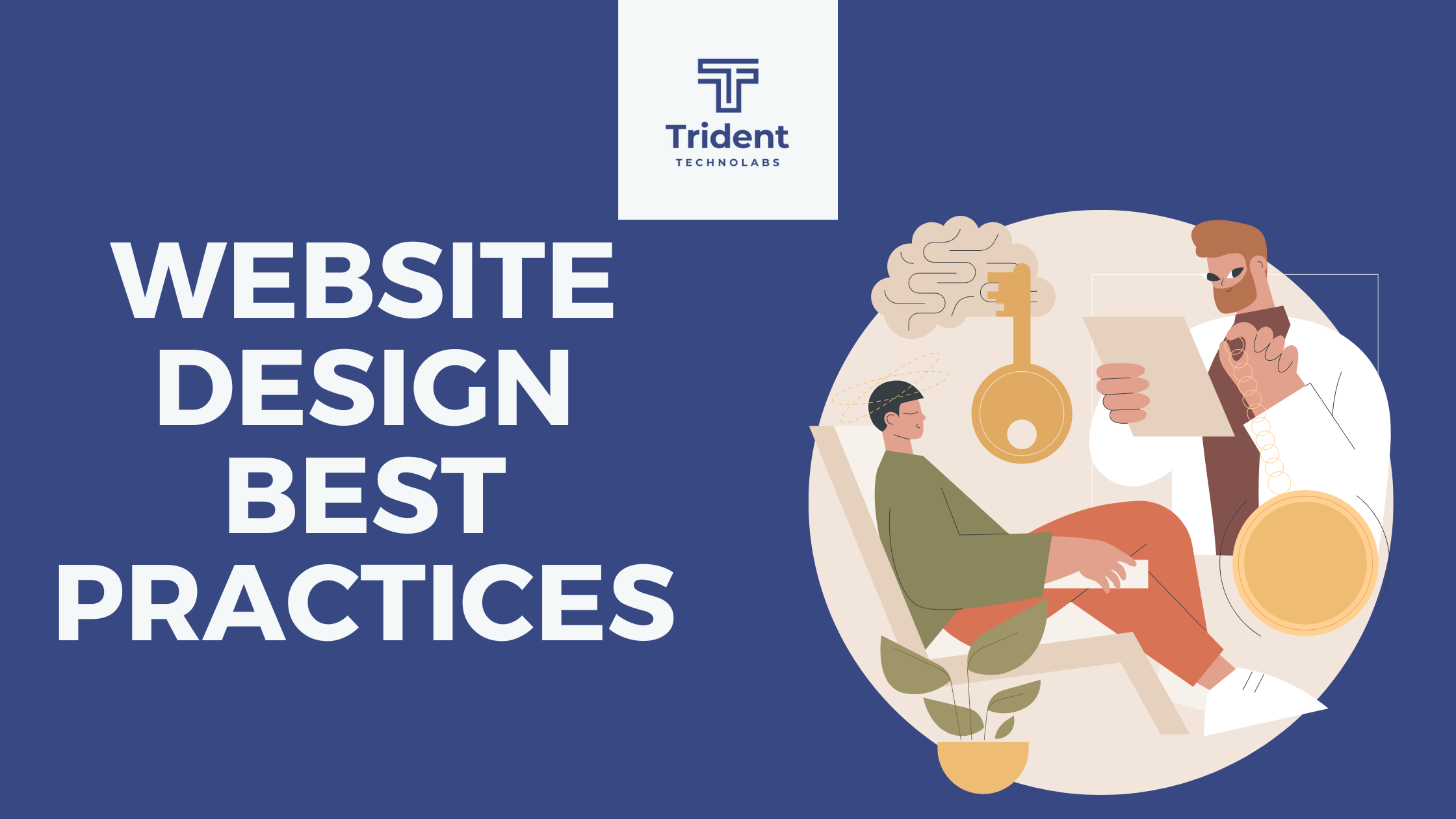
Website Design Best Practices
Here we are to share some best website design practices for your website after you have read Website Design Guidelines and Website Design requirements
- Select a typography that’s easy to read and skim.
- Choose a color scheme that suits your brand.
- Use white space to break up text and other elements.
- Use texture to add personality and depth.
- Add images to engage and inform readers.
- Simplify your navigation.
- Make your CTAs stand out.
- Optimize for mobile.
- Limit the options presented to users.
Let’s start to understand the website design best practices.
1. Select a typography that’s easy to read and skim.
Typography refers to how type — meaning letters and characters — are arranged and presented on the page. Since website typography affects not only how we read but how we feel about text on a web page, it’s important to pick carefully.
Ideally, you want a typeface that is:
- easy to read
- easy to skim
- accessible to all users
- legible across multiple devices and screen sizes
You also want it to match the look and feel of your brand. For example, the luxury fashion brand Burberry refreshed its logo for the first time in 20 years in 2018. It replaced the old serif typeface with a bold, all-caps, sans serif typeface and dropped the knight emblem. The result is a simpler and more modern-looking logo that’s easier to read on any screen — and that reflects changes in the company to become more transparent and appeal to a younger generation.

2. Choose a color scheme that suits your brand.
Like typography, color can affect not only how we understand and interact with content, but how we feel about it. Your color scheme should therefore check off the same boxes as your website typography. It should:
- reinforce your brand identity
- make your site easy to read and navigate
- evoke emotion
- look good
Buzzfeed, for examples, uses the primary colors yellow and red to grab users’ attention and get them excited about the content. It reserves the use of the primary color blue — which is associated with trust — exclusively for links and CTA buttons. Both emotions are ideal to evoke for a media site.

Image Source
Lets move to this point of website design best practices.
3. Use white space to break up text and other elements.
Whitespace refers to the negative areas in any composition. Whitespace provides users with visual breaks as they process a website’s design or content, which is not only aesthetically pleasing. By minimizing distractions, whitespace makes it easier for users to focus, process information, and understand what it’s important.
That means you can use whitespace to avoid causing information overload or analysis paralysis — and to emphasize important elements on the page. This might help persuade users to take a specific action, like sign up for a newsletter, shop your latest collection, and more.
For example, Eb & flow Yoga Studio uses whitespace to lead users toward a specific action: to sign up for three weeks of classes. Notice that whitespace doesn’t mean the absence of color or imagery. Instead, it means that every element on the page is positioned strategically, with lots of space in between, to avoid overwhelming or confusing visitors.

4. Use texture to add personality and depth.
Resembling a three-dimensional, tactile surface, web textures aim to replicate the physical sensation of touch with another sensation — sight. They’re a great design alternative to solid color backgrounds, particularly if you want to add personality and depth to your site.
Take a look at the texture on the homepage for the Santa Barbara-based restaurant Mony’s Tacos below. It looks like chalk drawn on a blackboard, doesn’t it? I don’t know about you but I can almost feel the chalk on my fingers just from looking at it. It’s the perfect look for a restaurant that aims to be California’s preferred Funk Zone choice for Mexican delights.

Lets move to 5th point of website design best practices.
5. Add images to engage and inform readers.
Striking a balance between text and images is essential in website design. Incorporating visuals can make your content more informative, engaging, and memorable. You’ve probably heard the statistics that people remember only 20% of what they read, but 80% of what they see? While the exact percentages are debated, the basic idea isn’t. It’s easier for some people to learn and process information visually.
Here’s a unique example of breaking up text with images from a cosmetic company’s website. This shows how endless the possibilities of incorporating imagery into your website design are.

6. Simplify your navigation.
Navigation is one of the most important design elements on a website. It impacts whether visitors arrive on your homepage and browse, or click the “Back” button. That’s why it’s important to keep it as simple as possible.
Many websites opt for a horizontal navigation bar. This navigation style lists the major pages side by side and is placed in the website header.
Take the navigation bar on Blavity as an example. The sections featured include three content categories — “News,” “Op-Eds,” and “Lifestyle” — as well as links to their submission page and sign-up page. This provides visitors with easy access to the pages they’re likely looking for. Other nav items are placed in a dropdown menu labelled “More” so they’re still easy to find but not cluttered into the top-level navigation. Finally, the navigation bar is sticky so visitors won’t have to scroll up and down the page to browse the site.

Let’s move to the seventh point of website design best practices.
7. Make your CTAs stand out.
CTAs are elements on a web page, advertisement, or another piece of content that encourages the audience to do something. The call to action could be to sign up, subscribe, start a free trial, or learn more, among many others.
You want your CTAs to pop in your website design. To make that happen, consider how you’re using color as well as other elements like background color, surrounding images, and surrounding text.
Square provides an excellent call-to-action example. Using a single image to showcase the simplicity of using their product, Square uses bold typography to also show how unique and future-oriented their product is. Against this dramatic backdrop, the blue “Get Started” CTA awaits your click.

8. Optimize for mobile.
We’ve already discussed how important it is for your website to be responsive. But since mobile devices accounted for 59% of organic search engine visits in 2021, we’re doubling down on how important it is to design your website to be mobile-friendly. That might mean altering or removing some elements that would clutter smaller screen sizes or negatively impact load time.
For an example of one of the best mobile website designs, compare Etsy’s homepage on desktop vs mobile. On desktop, you’ll see a navbar with categories. Hovering over each category will reveal a dropdown menu.

On mobile, this collapses behind a hamburger button, which improves the appearance and performance of the mobile site. You’ll also notice that the images are larger — perfect for tapping with your finger on a mobile screen.

9. Limit the options presented to users.
According to Hick’s Law, increasing the number and complexity of choices will increase the time it takes for a person to make a decision. This is bad news in website design. If a website visitor is presented with too many options, they might get frustrated and bounce — or they might pick an option you don’t want, like abandoning their cart. That’s why it’s important to limit the number of options presented to a user.
For example, a visitor landing on the homepage of Shawn Michelle’s Ice Cream will have three options: to learn more about the company, the flavors, or the ingredients. But instead of presenting all three options at the same time, they are presented one at a time in a slider. This is a great example of implementing Hick’s Law in UX design. 
Image Source
Pro-Tip: Don’t have the time to follow the rules? You can always download a pre-built website template that will provide a sound foundation for your site.
Now we understand the principles and best practices that should guide you throughout the design process. In the next section, let’s run down the essential page elements that you should strongly consider including in your design plan.
Leave a comment: