
15 Modern Web Design Elements For 2023
A professional website requires a cutting-edge, contemporary design. Additionally, contemporary web design components must be current and fulfil consumer needs. Utilizing these components contributes to a smooth and lovely website experience. The audience expects extraordinary things from website designs every day. The most recent trends in web design are more user-friendly, organised, and innovative.
Adding basic content and developing a few pages won’t be sufficient for businesses now that having a website is essential. You need a top-notch website design if you want to have a strong online presence. The use of effective web design features can increase viewership.
In order to increase the functionality of a website, this article examines 15 key web design components. Learn more by reading on!
The Most Crucial Web Design Elements to Check Out In 2022
There are countless web design components available to improve your website. We’ve gathered some of the top contemporary design components to improve the performance of your website to make it easier for you to choose the ideal ones for it.
1. Background Videos
Automatic background films can greatly enhance the appeal of a website. You can use them to convey stories and reduce the amount of other content you need to describe your company. These movies aid visitors in comprehending the essential information about your company.
Additionally, not everyone enjoys reading lengthy texts. Videos make it easier and more simple for people to comprehend the key ideas of your company.
2. Bold Color Scheme
Modern websites seem better when they are painted in vivid, striking colours. Choose your website’s colour scheme in accordance with the tone of your brand. Certain hues correspond to certain emotions.
For instance, blue conveys real power, safety, and assurance. As a result, blue is a popular colour for websites. Additionally, you can select some remarkable and distinctive hues to draw in more people.
3. Rotated Texts
In web designs, rotated text is a fairly common feature. It can give your website an editorial appearance and is incredibly eye-catching. You can use this text to decorate your website even though it cannot be used like marquees.
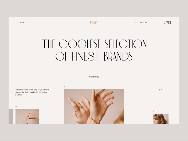
4. Exceptional Typography
The majority of businesses select a certain typography or typeface to help their clientele distinguish them from their rivals. Additionally, typography makes it simpler for companies to convey their brands.
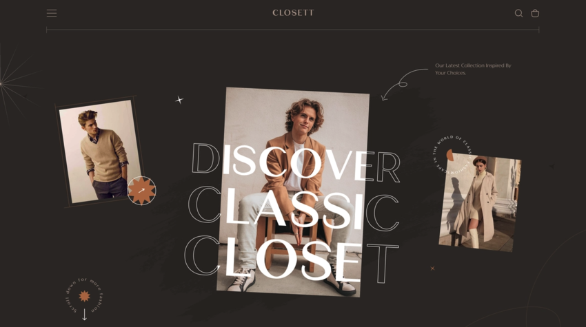
All of the website pages have a consistent appearance thanks to typography. Your brand’s identity is displayed through your typographic choices. It reveals whether your company is serious, entertaining, educational, or practical. Make sure your designer allows the execution of your chosen typeface across devices and browsers, whatever it may be.
10 Hot Web Development Trends for 2023
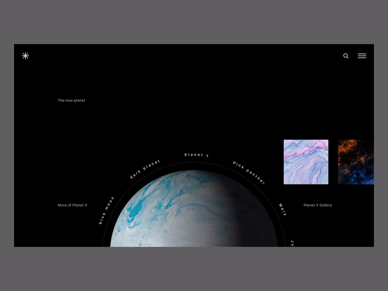
5. Minimalism
People occasionally mix up modernism and minimalism. Despite their differences, they have a significant impact on one another. While modernism adheres to an airy, as streamlined and clean-lined as possible design, minimalism adheres to the maxim “less is more.”
Consider the idea of minimalism when creating a contemporary website. And following the simple idea will enable visitors to instantly collect the information you have presented. Furthermore, a website might benefit greatly from a basic design.
6. Seamless Navigation
The incorporation of the website’s menus and links is part of website navigation. The association between distinct pages and how easily visitors can find them are impacted by the navigation menu.
You should manage how visitors access everything on your website because nobody stays on a site that is difficult to use. In order to allow consumers to rapidly reach any area of the website that interests them, maintain navigation simple and responsive.
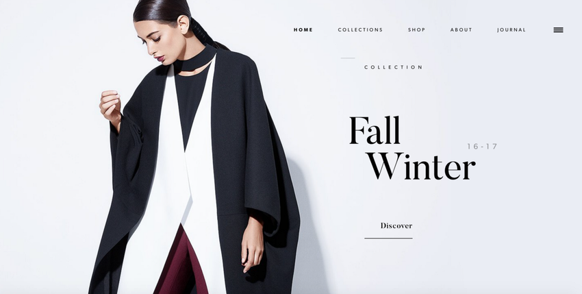
7. White Space
White space is frequently ignored when it comes to site design. After all, it has the power to completely alter the website’s appearance. Users may become confused and decide to quit your website if you add a lot of information or design features.
By allowing readers to breathe and get ready to read the next paragraph, you may encourage them to take a break from all content by including white space. This web design component is, in a nutshell, a very important visual break. It creates a clear view and eliminates all distractions that hinder easy website navigation.
Modern website design must have white space because it helps people read important information that they might ignore in a rush. In other words, white space gives websites a more streamlined, airy appearance.
Laravel Development: What Is It? The Complete 2023 Guide
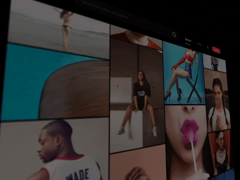
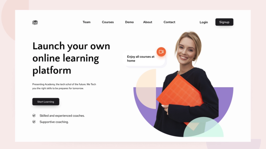
8. High-quality Images
Reduce the amount of long texts on your website and replace them with captivating images to improve its visual appeal. These visuals can draw visitors to a contemporary website and encourage them to become customers.
To tell the story of your company, be sure to include a variety of high-quality photographs on your website. Product photos can speak with visitors in a natural way and express the message you want to share.
9. Call-To-Actions
We’ve already talked about how important user-friendly navigation is for websites. Additionally, CTA (Call-To-Action) buttons increase the likelihood of turning visitors into customers. They lead website visitors through it.
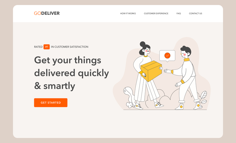
You must think about the button’s design, placement, and text when making a CTA button. Every page of your website might have a Call-To-Action button, depending on the needs of your website.
10. Animation
When users scroll, click, or hover over an element of a website, animation enhances the user experience and makes the site appear more interactive. Users tend to focus on movement, therefore animation can draw in more users.
Motion and animation can evoke fun, which encourages users to stay on a website for extended periods of time. The following items would make good animation designs for your website:
- Spinning elements
- 3D motion
- Playful button or cursor
- Navigation menu animation
- Rotating images
11. Semi-Flat Design
Users find flat design easier to understand, and websites without complicated or overly technical aspects can load more quickly when using it. Since flat design makes website material easier to understand, several businesses have adopted it.
Whether you choose to utilise a flat design, shadows, or other components, it must be subdued and consistent throughout the entire website. Please employ consistent design cues throughout the entire website, including all of its pages and parts, to make it easier for users to grasp what they are reading.
12. Card Design
These days, a lot of organisations use card designs. Cards make it easier to visually distribute information so that website users may navigate it without getting lost. Users can select which content they wish to read if you divide your content into cards.
It maintains a website organised and clutter-free and ensures that there isn’t too much content. Today, a lot of B2B and B2C businesses employ card designs to give customers information that is simple to understand. Your website’s layout can assist in highlighting key goods, services, or solutions side by side.
Make sure that your cards remain responsive, nevertheless. The size and quantity of displayed cards must adjust when the screen size changes, either larger or lower.
13. Mobile-Friendly Website Layouts
Layouts for mobile-friendly websites adhere to the guidelines for responsive web design. It makes it possible for website elements like user interfaces, text, and photos to automatically resize and scale in accordance with the devices visitors use to access your website.
By April 2022, mobile devices will account for 59.5% of all website traffic. This demonstrates unequivocally why your website has to be responsive. Potential customers won’t be able to find what they’re looking for if images, text, and buttons don’t adjust to fit smaller screen sizes and touchscreen controls.
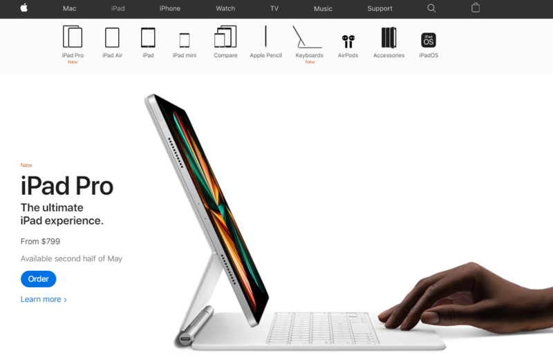
14. Hero Images
Another well-known component of web design is the homepage image that fills the entire screen. The largest banner images to utilise above the fold are heroes to draw in more users and pique their curiosity.
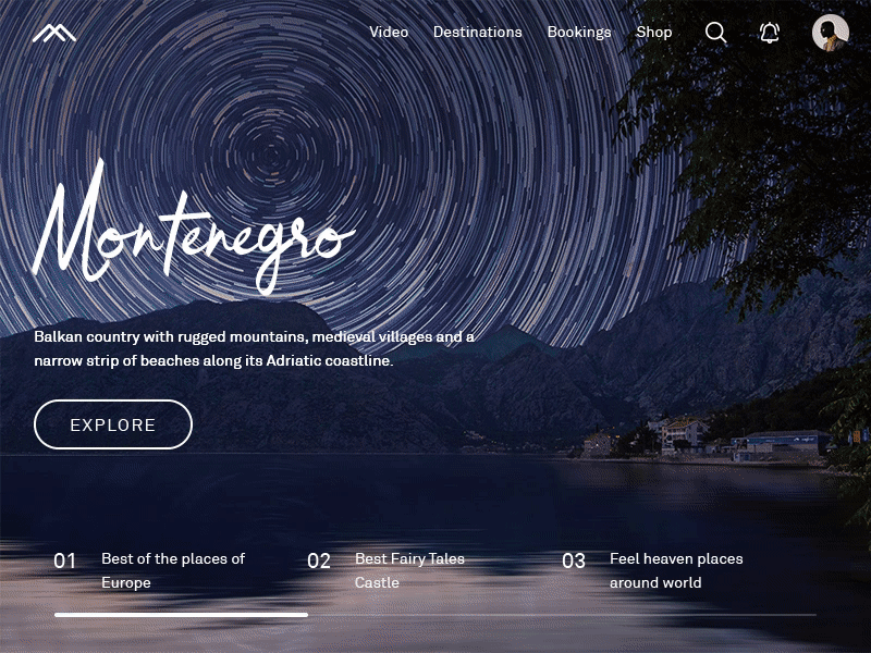
To make it easier for people to understand the text above hero photos, keep them simple. If the text crosses the navigation menu, it needs to be larger and a contrastive colour. It guarantees crisp visibility.
15. Hamburger Menus
Long website menus provide the advantage of guiding users to the appropriate pages. But they take up a lot of screen real estate. The hamburger menu does not operate in the same way. They free up space and improve user navigation.
Your website pages must provide users with an easy way to navigate. Therefore, simplifying navigation makes for a smoother, less distracting user experience. Additionally, it enables users to compile the data they require in order to perform an action.
Final Thoughts
We have spoken about some of the most common web design components to create the most stunning website and add a unique touch to make it more appealing to consumers.
Although there are many more design elements available for creating websites, you can get started by using the fundamental ones mentioned above.
Leave a comment: